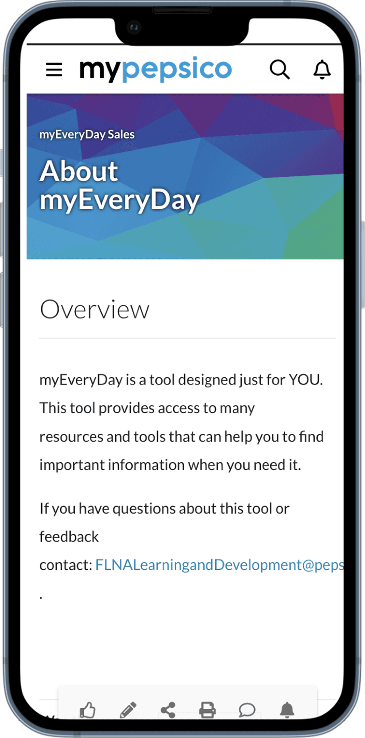
PepsiCo | myEveryDay
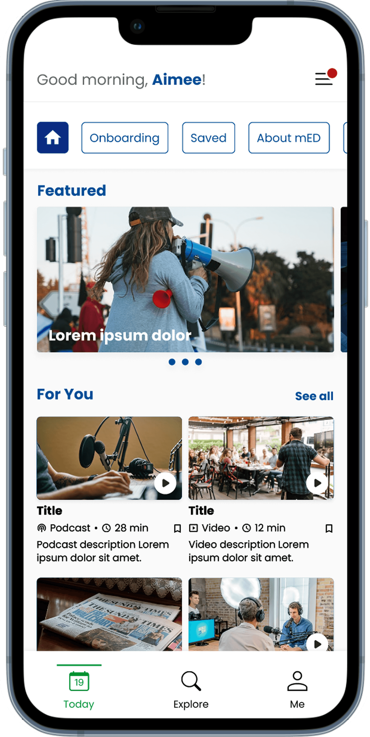
PepsiCo’s myEveryDay tool is a daily resource for frontline employees, but the experience had become cluttered, hard to navigate, and slow to use. I redesigned the platform to simplify workflows, reduce friction, and make essential content easier to find. The updated experience cut clicks, lowered support calls, and saved delivery drivers meaningful time each day, which improved both usability and operational efficiency.
Lead Designer
Product Managers
UX Researcher
Stakeholders
10 weeks
Challenge
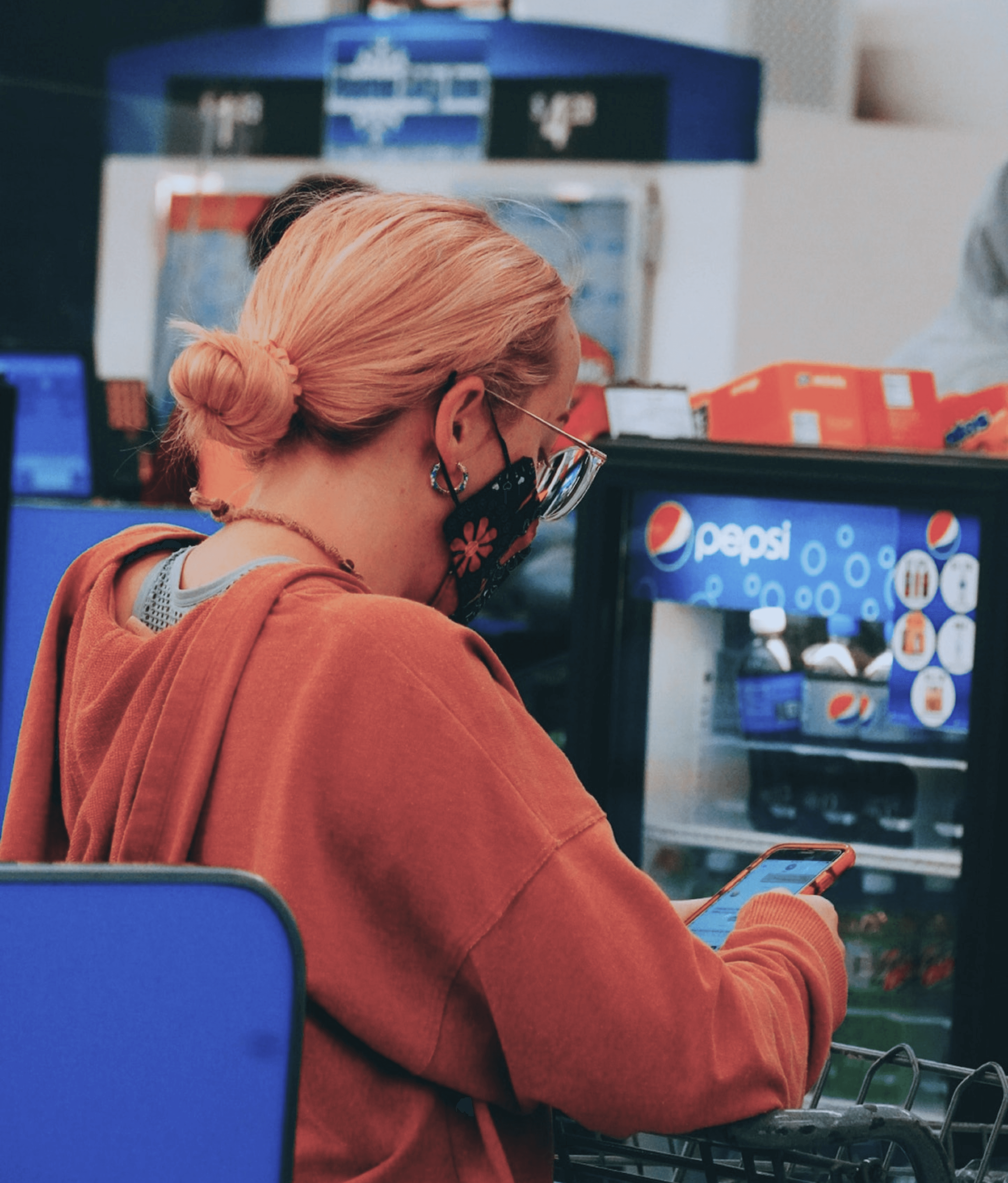
Frontline employees relied on myEveryDay for quick answers, but the tool was buried inside myPepsiCo and overloaded with content. Drivers were losing time, getting frustrated, and often giving up or calling for help instead.
Results
Frontline teams were able to find information faster with fewer clicks and fewer mistakes. Drivers gained back 40 minutes a day, and support calls dropped as navigation became more intuitive.
78%
Reduction of clicks
40 min
Saved per driver per day
Before
After
Process
Research & Analysis: Interviewed frontline employees, stakeholders, and new hires, and reviewed in-app analytics to understand where people were getting stuck. I also looked at competitor tools to see how other teams solved similar problems.
Information Architecture: Based on what we learned, I reorganized the structure of myEveryDay so key tasks were easier to find. This included cleaning up navigation, removing noise, and grouping content in a way that matched real workflows.
Wireframing & Prototyping: I created low-fidelity wireframes to visualize new layouts and flows, then refined them with feedback from the UX researcher, product team, and frontline testers. Once aligned, I built a high-fidelity interactive prototype to validate the direction.
Usability Testing: We tested the prototype with a mix of frontline roles to see how quickly they could complete common tasks. Their feedback guided several rounds of improvements, especially around clarity and speed.
Visual Design & Style Guide: I developed a clear visual system that simplified the experience and made content easier to scan. I also built a style guide so future updates would stay consistent as the tool grows.

“ It has been so great having Joyce as the Lead Designer for one of my technology enhancement projects that reaches 25K+ frontline sales employees daily. I have really been impressed by Joyce’s organizational skills and her ability to leverage innovative tools to bring our vision to life. She is an incredible listener and collaborator and will take ideas anyone has to the next level! ”

Carissa Levingston
Senior Talent Management Analyst | PepsiCo

Conclusion
The redesigned myEveryDay experience became faster, clearer, and more supportive for the people who rely on it most. By simplifying the workflow, frontline teams were able to find answers quickly and stay focused on their work. The changes reduced clicks, cut down support calls, and saved drivers real time each day, showing how thoughtful design can directly impact both usability and operations.